Thursday, December 3, 2009

Final Project


My Big Idea is Society. I developed this by exploring the struggles women face and pressures they feel to be thin. Society has an incredible way of influencing young women to mimic the cookie cutter models of the world through advertising, magazines, television, internet and many other mediums. These pieces deal with body image and self-esteem, which happen to be the most sensitive issues for all women. I am passionate about this Big Idea because I have a family member who has suffered an eating disorder for years. I found inspiration from Christi Nielsen’s photography. She recently had an exhibit entitled “I’m Just about to Get Skinny.” Many of her photographs are atrocious and mind-boggling, and deal with the issue that I am addressing. With this final, it is my hope that young women can begin to challenge these societal pressures and break the mold of being tall, skinny, and gorgeous according to society's standards.


http://www.youtube.com/watch?v=R3i6KfcUX9I


http://www.youtube.com/watch?v=3pPMijLe8KI

Blog #5

Lindsay Wamble

Blog #5

1. With my midterm, I felt as if I had a concrete Big Idea and good project to show for it. However, after creating my final, I realized that art is more than just putting images together and manipulating them to make a cohesive project. I feel as if I was a part of my final, and that there was so much more meaning when taking my own photographs and sear hing for ones that I felt worked immaculately with my Big Idea. Technique wise, between my midterm and final, I learned to make the image look more cohesive. I learned how to rasterize texts, transform images so they looked like actual tattoos upon my skin, and how to animate both pieces of the final. I'm proud of how the animation turned out and added so much to the final images. The in-class discussion was awesome! Everyone had such great things to say that really made sense with my project. Many students came up with things I had never even thought about that worked perfectly with the Big Idea.

----->


2. At the beginning of the quarter, I was completely lost and felt overwhelmed every day. As time went on, and I spent more and more time outside of class, that all changed. The quizzes were always the most difficult thing for me to create. Quiz #1 was atrocious and Quiz #4 was not much better. I learned that more time outside of class was necessary after receiving a C on the first one. I was confused about the exact credentials for the 4th one and that is why I didn't create a movie poster with characters from the movie. However, from the 1st to the 4th quiz, it is extremely apparent that I learned countless techniques in terms of layout, design, and cohesiveness.

Basic layering was one of the most difficult things for me at the beginning of the quarter. By the end of the quarter, with my final, it is obvious that I understand layers: the opacity and fill levels along with blending options. Masks were also difficult for me a very long time. I considered never working with them, but again with my final, you can see I used masks on almost every layer in order the get rid of the harsh lines of the photographs.

---->

3. With my midterm, I felt as if I had a concrete Big Idea and good project to show for it. However, after creating my final, I realized that art is more than just putting images together and manipulating them to make a cohesive project. With my final, I did a lot of research beforehand on artists with similar ideas and tastes as myself and delved into a Big Idea in which I am passionate. I have a family member whom I am very close to that has suffered an eating disorder for years. I've also had weight issues for a long time and feel negative about my body image almost every single day. I feel as if I was a part of my final, and that there was so much more meaning when taking my own photographs and searching for ones that I felt worked immaculately with my Big Idea. When creating art, it has to go beyond just technique. You can teach techniques to everyone, but you cannot teach someone to become one with their art; to dig deep into their soul and thoughts to pull out their thoughts and feelings and then put them on a piece of paper, or say a photoshop document.

& ------> &

Tuesday, November 17, 2009

Blog #4

1) Artist Statement (about 100 words)

My Big Idea is Identity. I will be focusing on teens trying to find out who they are. The subject in my final stares at herself in a mirror seeing all of the possibilities of who she is and can become. The media plays a huge role in her development as well as many other young women. They are expected to look, act and feel a certain way based on what the media and other sources show them. The images that fade into the mirror signify the thoughts running through the average teen's mind. This work could definitely be used for an advertisement.

2 )
Artist- Teesha Moore: I love the way here abstract art looks somewhat like a crazy scapbook. I like the following image because it shows a young girl looking around at different images that have to do with her life. I want to mimic the aspect of a teen contemplating and thinking about her life and who she is in my final project.

References:

An interesting picture I found while searching for Identity images.

Magazines, especially ones such as Cosmopolitan, instill ideas into teen's heads.


Church and Religion in general have a huge factor on one's identity.

Identity Works:

http://www.pbs.org/cgi-registry/mediaplayer/videoplayer.cgi?playeraddress=videoplayer.cgi;media=/art21/IDENTITY_lo.rm,/art21/IDENTITY_hi.rm,/art21/IDENTITY_lo.mov,/art21/IDENTITY_hi.mov,/art21/IDENTITY_lo.wmv,/art21/IDENTITY_hi.wmv;title=Preview%20of%20the%20Art:21%20documentary%20film%20"Identity";widescreen=true;playertemplate=/art21/Templates/art21_mp.html

http://farm4.static.flickr.com/3163/2928865392_cb4d4dfde9.jpg?v=0


3) I would like to employ shadows in my final project. I think they will add a dramatic effect that is necessary for my Big Idea of Identity. Shadows also coerce the image to look more cohesive because the images all appear to be a part of the background, not just copy and pasted onto the document. Here are some helpful links that will show me how to create shadows.

http://www.photoshopcafe.com/tutorials/cast_shadow/cast_shadow.htm

http://video.google.com/videosearch?source=ig&hl=en&rlz=1G1SNNT_ENUS353&q=how+to+create+shadows+in+photoshop&um=1&ie=UTF-8&ei=fvcCS_aNO8OklAf6zdjdAQ&sa=X&oi=video_result_group&ct=title&resnum=4&ved=0CBcQqwQwAw#

^Extremely helpful video.

Wednesday, November 11, 2009

Luc Tuymans & T.J.Clark Extra Credit

11/10 @ 7PM
The Wexner Center for the Arts: Lambert Family Lecture 2009

Luc Tuymans is considered to be one the most significant painters of his generation and T.J. Clark has received his PhD in art history and is a professor of art at the University of Carlifornia, Berkeley and is also the author of numerous books.

The fist topic of the evening was putting words to the pictures. Clark believes Tuymans is not only a great painter but also excellent at putting words to his paintings. They brought up one of his paintings on the projector. T.J. Clark spent a few minutes describing the painting from his perspective. Luc then agreed on some of T.J.'s points. He said the painting was not pre-meditated and came easily to him. He most definitely draws on his heritage throughout his work. They discussed the main focus of the image, which was the soldier with the yellow and black cap on. It is important to work with the imagery.
Next, they discussed the question of politics in his artwork. The image on the screen now was "our new quarters." The color green accessed a moral issue and the words on the painting were employed in order to terminate it. Tuymans admitted his hesitancy toward creating this painting because he felt like "don't dare go there if you haven't been there," but he decided he didn't care and went for it.
The third image on the projector was the black and yellow flag. The necessity of political instigation gives the picture something to think about. Tuymans discussed his hometown where racism was prevalent and they were right-winged radicals. He wanted to create an image to give them back what they wanted to loose.
As the lecture went on, they addressed the fact that paintings are a way of thinking things out. Imagery deconstructs itself and the size of image can be "detrimental." Tuymans is deeply fascinated with television. He was a child of television, which means learning is based on images rather art, writing, reading, etc. His art is also influenced by photography. Photography, to him, is proof. There is the element of interpretation. Lastly, before they opened the lecture up for questions, they discussed color.

Monday, November 9, 2009

Midterm Project


Artist Statement
My Big Idea is Emotion. As I explored Photoshop and the images I've created throughout the midterm process, I wanted to focus on the extremes of emotion. Personally, I feel that sadness is the worst emotion to experience and happiness is the best. I felt as if the images would contrast each other and each one would evoke these emotions when looking at them. When thinking of the saddest thing anyone could go through, I came up with a parent dealing with a child's suicide. I created a dark, cryptic image that would make any mother cringe. On a lighter note, to me happiness is to love and be loved. I created a brighter image where two people stare at a collage of things for which they are thankful and make them happy.


Sunday, November 8, 2009

Blog # 3

Caroline Magerl
While searching for artists, I wanted to find an artist that could portray human emotions or feelings in an interesting and intricate way because that was my original goal with the midterm project. I stumbled across Caroline Magerl. She is an Australian painter and illustrator of figurative works. She depicts fears, hopes, dreams, and obsessions. When studying Caroline’s work, it appears to be simple yet when you look deeper, you can see how translates true emotions. It is extremely fascinating how she uses the people in her works to show this emotion. When I looked at her art, I questioned what materials she used and if that affected her main theme. According to her website, she was feeling detached from the world before she stared painting. Her artwork evokes emotion as you study it. “The result is truly a picture from her heart as well as a window in to her world”. I think that after looking at her paintings, I’m going to try and work with creating an image that delves into my world so all of those who view my artwork can see why I chose to create such an image.


Bert Monroy
Bert Monroy is considered one of the pioneers of the digital world; he worked with advertising for years before discovering his true passion. Bert is the coauthor of The Official Adobe Photoshop Handbook. I chose to write about Bert because I found his artwork to be creative and appear very realistic. He focuses on a specific item, distorts it slightly, and uses bright and extravagant colors to bring the artwork to life. Also, I like his artwork because he uses everyday, minute objects that people usually pay no attention to and makes it so people want to look at it. In my opinion, Bert’s Big Idea is everyday life. There are so many things in our lives and in the things that we do that we don’t really notice. I found Bert’s artwork to be important for my own because sometimes I forget to include the minor details in my pictures, such as objects in the background that I didn’t think were important to change or alter using Photoshop. I also found his artwork inspiring because he uses Photoshop as well as me, and I can predict the tools that he used in creating his pictures which is pretty cool.


Wednesday, October 28, 2009

Midterm Artist Statement Rough Draft


My Big Idea is Human Emotion. Human emotion is one of the most interesting and complex ideas to understand. As I continued to work on this midterm process, I began to really focus on what people feel on a day-to-day basis and compared it to what people want to feel. The images I have employed depict anger, sadness and other dark emotions on the left side, while on the right; I focused more on happy, carefree and bright emotions. This Big Idea is important to me because being a freshman brings about numerous changes and difficulties and I feel emotionally distraught quite often when I wish to feel carefree and happy.


Brainstorm:


ModMean:


Friday, October 23, 2009

Blog Assignment #2: Even Rain Can't Keep Them Away!


Creating Rain


Hyperlink: http://fx.worth1000.com/tutorials/161124/how-to-create-rain


1st Snapshot- In this snapshot, I have used the "curves" tool in order to darken the sky and give it a rainy day appearance. I wanted it to look as if the storm was rolling in, therefore the sky to the left is darker than the one to the right. Next, I used the curve tool again to darken the sidewalks. I wanted them to look as if the rain has been falling on them for quite some time. I used the magic wand tool for both of these selections.


2nd Snapshot- In order to create a cohesive image, I thought that making the entire scene look wet would make the rain look more believable. Therefore, I worked with the brightness/ contrast to work with the roof to make it look darker. I deviated from the tutorial because I wanted to work with the water, to give it a ripple effect using the filter menu in order to appear as if the rain was falling down hard upon it. I used the magic wand tool to select the water before giving it the ripple effect. I felt that the sidewalks looked a little unrealistic, so I made them a little lighter using the contrast/brightness tool.
3rd Snapshot- In the third snapshot, I created rain by adding a new layer, making it white, and then adding noise. After adding noise, I used the motion blur tool and changed the angle at which the "rain" and fell and the distance between pixels. I went to the layers palette and used the screen option and all of a sudden it was raining! I found this step the most difficult because I could not find the perfect opacity or level of noise to make it look completely natural. In the actual image, the rain appears a lot more natural than in the small picture shown below. I was aiming for a drastic image that would make others question why those crazy people were still in the pool while a storm was blowing in.

Tuesday, October 13, 2009

Big Idea Words

Big Idea: Emotion

Abandoned Compassionate Disappointed
Accepting Confident Remorse
Fear Conflicted Submission
Anger Denial Aggressiveness
Joy Desolate Awe
Saddness Devastated Contempt
Disgust Rejection Lust
Surprised Enraged Longing
Guilt Envy Nervousness
Worry Dismay Sympathy
Anxiety Excited Relief
Stress Greedy Caring
Agony Great Desire
Amused Grumpy Pride
Annoyed Hate Rage
Argumentative Love Confusion
Aroused Impatient Courage
Bitter Anticipation Pity
Joy Bothered Respect
Trust Awkward Horror
Depressed Cynical Homesickness
Deep Optimism Mortified

Sunday, October 4, 2009

Blog #1

Laurie Simmons:

1. 1) http://www.metmuseum.org/TOAH/hd/pcgn/ho_1998.440.htm - Walking Gun
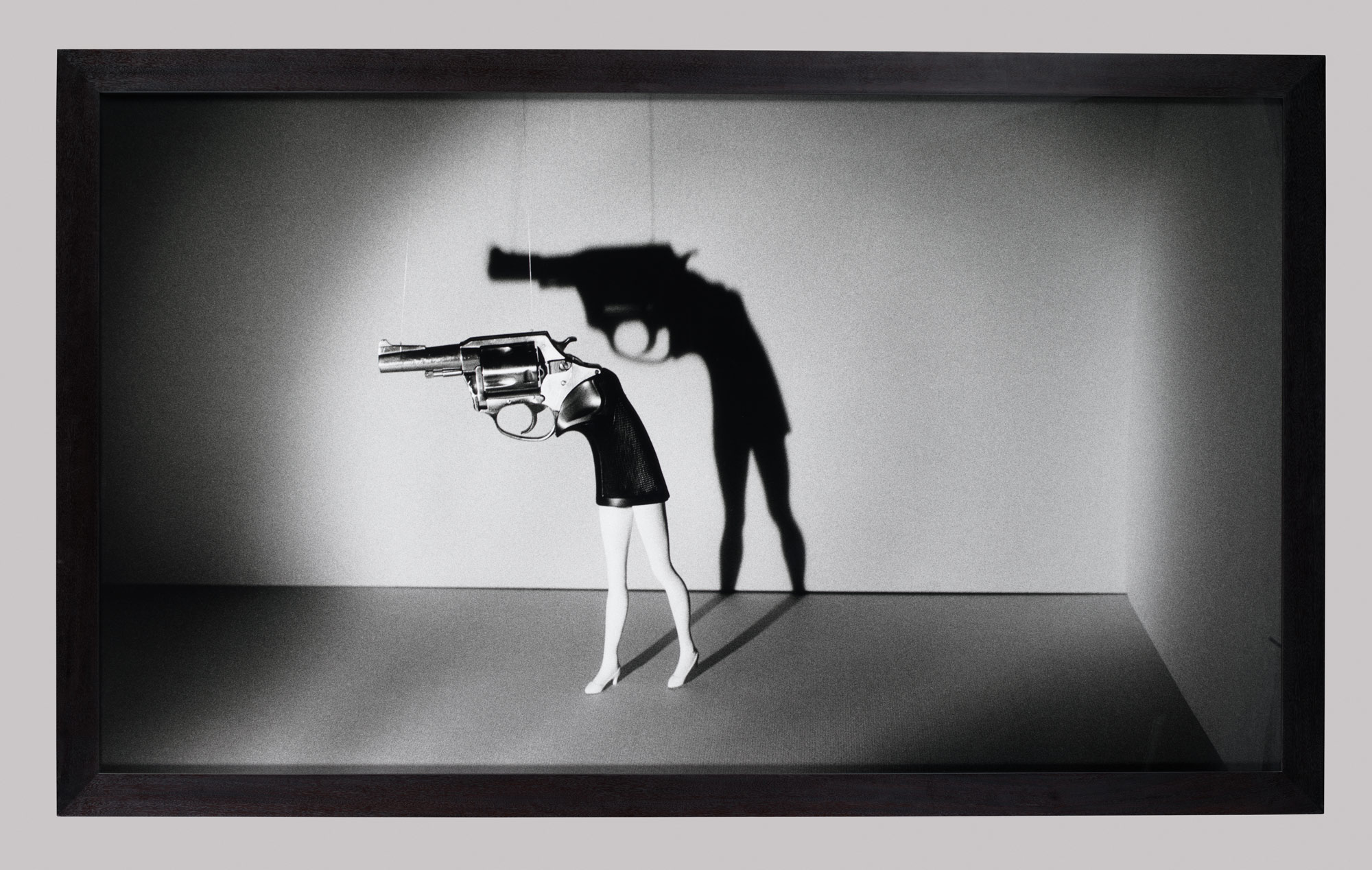

Denotation: The picture is in black and white. The combination of the two colors creates a gray color as well. There is a spotlight on the image of the walking gun, and a shadow around the edges. The spotlight creates a shadow of the walking gun behind the original image, making the background gun look larger and more prominent. The slender legs of the gun appear to belong to a doll wearing high heels. The legs are not facing forward. The legs look as if they are molded right into the gun. At the tip of the gun and near the muzzle, there are nearly transparent strings holding it upwards. The gun is facing toward the left. The whole scene appears to take place inside a shadow box.

Connotation: Laurie Simmons is well known for her use of inanimate objects such as paper dolls, ventriloquists, Barbie dolls, and puppets. She stages these objects and utilizes a dramatic use of lighting in order to create her images. In the past, women have been viewed as merely objects, just acting as a womb that cooks and cleans for their families. In today’s contemporary world, many women have the choice of what they want to do. They can choose whether to be a vessel carrying an offspring or they can find their place in the workforce or even a combination of both. The purpose of this picture is to show “women as objects.” However, even though women can be viewed as objects, they are still in charge. It appears that the string has the power of pulling the trigger. It is like a puppet and society is the puppeteer.

2. 2) http://www.mediabistro.com/unbeige/original/(Laurie%20Simmons).jpg -Glamour Pictures

Denotation: The image is colorful and bright. She is in a bathroom setting. There is a pink sink and bathtub, a colorful floor, and a black and white tiled wall. The Barbie doll almost appears to be an actual woman because of the lighting. The size of the doll is large and in charge which is apparent by the looks of the size of the bathtub and sink. It looks as if it is a doll house because the proportions aren’t feasible. She is set up in a provocative manner. The Barbie is slender, blonde, and busty. We can see her figure very well because she is not clothed. Her skin is tan and glossy and is contrasted with the white bathing suit and colorful background. The position of her body is awkward and she is staring at the ground.

Connotation: Laurie Simmons was asked along with nine other female artists for the 70th anniversary of Glamour magazine to create an image of what their perspective of glamour is. Laurie’s perception of glamour is depicted in this piece. The position of the doll makes her appear “slutty” or “easy” as some say these days because of the attention drawn to her private parts. The attention is immediately drawn to the doll’s physical anatomy, thus objectifying her. The woman is purposely put in this position to be the center of attention of the shot. The Barbie’s gaze is focused on the floor, instead of straight forward, looking at the viewer. Because she is staring at the ground, she is most likely searching for something, or does not feel completely confident in herself. She is in a domestic setting and could most likely a housewife.