Tuesday, November 17, 2009

Blog #4

1) Artist Statement (about 100 words)

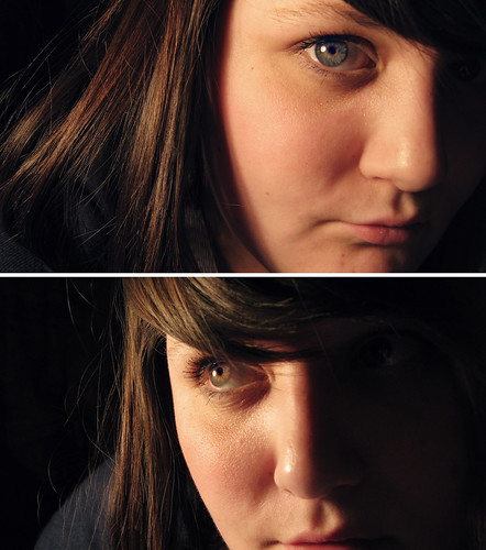
My Big Idea is Identity. I will be focusing on teens trying to find out who they are. The subject in my final stares at herself in a mirror seeing all of the possibilities of who she is and can become. The media plays a huge role in her development as well as many other young women. They are expected to look, act and feel a certain way based on what the media and other sources show them. The images that fade into the mirror signify the thoughts running through the average teen's mind. This work could definitely be used for an advertisement.

2 )
Artist- Teesha Moore: I love the way here abstract art looks somewhat like a crazy scapbook. I like the following image because it shows a young girl looking around at different images that have to do with her life. I want to mimic the aspect of a teen contemplating and thinking about her life and who she is in my final project.

References:

An interesting picture I found while searching for Identity images.

Magazines, especially ones such as Cosmopolitan, instill ideas into teen's heads.


Church and Religion in general have a huge factor on one's identity.

Identity Works:

http://www.pbs.org/cgi-registry/mediaplayer/videoplayer.cgi?playeraddress=videoplayer.cgi;media=/art21/IDENTITY_lo.rm,/art21/IDENTITY_hi.rm,/art21/IDENTITY_lo.mov,/art21/IDENTITY_hi.mov,/art21/IDENTITY_lo.wmv,/art21/IDENTITY_hi.wmv;title=Preview%20of%20the%20Art:21%20documentary%20film%20"Identity";widescreen=true;playertemplate=/art21/Templates/art21_mp.html

http://farm4.static.flickr.com/3163/2928865392_cb4d4dfde9.jpg?v=0


3) I would like to employ shadows in my final project. I think they will add a dramatic effect that is necessary for my Big Idea of Identity. Shadows also coerce the image to look more cohesive because the images all appear to be a part of the background, not just copy and pasted onto the document. Here are some helpful links that will show me how to create shadows.

http://www.photoshopcafe.com/tutorials/cast_shadow/cast_shadow.htm

http://video.google.com/videosearch?source=ig&hl=en&rlz=1G1SNNT_ENUS353&q=how+to+create+shadows+in+photoshop&um=1&ie=UTF-8&ei=fvcCS_aNO8OklAf6zdjdAQ&sa=X&oi=video_result_group&ct=title&resnum=4&ved=0CBcQqwQwAw#

^Extremely helpful video.

Wednesday, November 11, 2009

Luc Tuymans & T.J.Clark Extra Credit

11/10 @ 7PM
The Wexner Center for the Arts: Lambert Family Lecture 2009

Luc Tuymans is considered to be one the most significant painters of his generation and T.J. Clark has received his PhD in art history and is a professor of art at the University of Carlifornia, Berkeley and is also the author of numerous books.

The fist topic of the evening was putting words to the pictures. Clark believes Tuymans is not only a great painter but also excellent at putting words to his paintings. They brought up one of his paintings on the projector. T.J. Clark spent a few minutes describing the painting from his perspective. Luc then agreed on some of T.J.'s points. He said the painting was not pre-meditated and came easily to him. He most definitely draws on his heritage throughout his work. They discussed the main focus of the image, which was the soldier with the yellow and black cap on. It is important to work with the imagery.
Next, they discussed the question of politics in his artwork. The image on the screen now was "our new quarters." The color green accessed a moral issue and the words on the painting were employed in order to terminate it. Tuymans admitted his hesitancy toward creating this painting because he felt like "don't dare go there if you haven't been there," but he decided he didn't care and went for it.
The third image on the projector was the black and yellow flag. The necessity of political instigation gives the picture something to think about. Tuymans discussed his hometown where racism was prevalent and they were right-winged radicals. He wanted to create an image to give them back what they wanted to loose.
As the lecture went on, they addressed the fact that paintings are a way of thinking things out. Imagery deconstructs itself and the size of image can be "detrimental." Tuymans is deeply fascinated with television. He was a child of television, which means learning is based on images rather art, writing, reading, etc. His art is also influenced by photography. Photography, to him, is proof. There is the element of interpretation. Lastly, before they opened the lecture up for questions, they discussed color.

Monday, November 9, 2009

Midterm Project


Artist Statement
My Big Idea is Emotion. As I explored Photoshop and the images I've created throughout the midterm process, I wanted to focus on the extremes of emotion. Personally, I feel that sadness is the worst emotion to experience and happiness is the best. I felt as if the images would contrast each other and each one would evoke these emotions when looking at them. When thinking of the saddest thing anyone could go through, I came up with a parent dealing with a child's suicide. I created a dark, cryptic image that would make any mother cringe. On a lighter note, to me happiness is to love and be loved. I created a brighter image where two people stare at a collage of things for which they are thankful and make them happy.


Sunday, November 8, 2009

Blog # 3

Caroline Magerl
While searching for artists, I wanted to find an artist that could portray human emotions or feelings in an interesting and intricate way because that was my original goal with the midterm project. I stumbled across Caroline Magerl. She is an Australian painter and illustrator of figurative works. She depicts fears, hopes, dreams, and obsessions. When studying Caroline’s work, it appears to be simple yet when you look deeper, you can see how translates true emotions. It is extremely fascinating how she uses the people in her works to show this emotion. When I looked at her art, I questioned what materials she used and if that affected her main theme. According to her website, she was feeling detached from the world before she stared painting. Her artwork evokes emotion as you study it. “The result is truly a picture from her heart as well as a window in to her world”. I think that after looking at her paintings, I’m going to try and work with creating an image that delves into my world so all of those who view my artwork can see why I chose to create such an image.


Bert Monroy
Bert Monroy is considered one of the pioneers of the digital world; he worked with advertising for years before discovering his true passion. Bert is the coauthor of The Official Adobe Photoshop Handbook. I chose to write about Bert because I found his artwork to be creative and appear very realistic. He focuses on a specific item, distorts it slightly, and uses bright and extravagant colors to bring the artwork to life. Also, I like his artwork because he uses everyday, minute objects that people usually pay no attention to and makes it so people want to look at it. In my opinion, Bert’s Big Idea is everyday life. There are so many things in our lives and in the things that we do that we don’t really notice. I found Bert’s artwork to be important for my own because sometimes I forget to include the minor details in my pictures, such as objects in the background that I didn’t think were important to change or alter using Photoshop. I also found his artwork inspiring because he uses Photoshop as well as me, and I can predict the tools that he used in creating his pictures which is pretty cool.